
R08
Crafted a brand identity for a tech company built on the idea that every great thing starts from zero.
Client
Reach Group
Timeline
July - September 2025
Role
Tools
Context
R08 is a newly established company under Reach Group, built to deliver advanced digital and tech solutions.
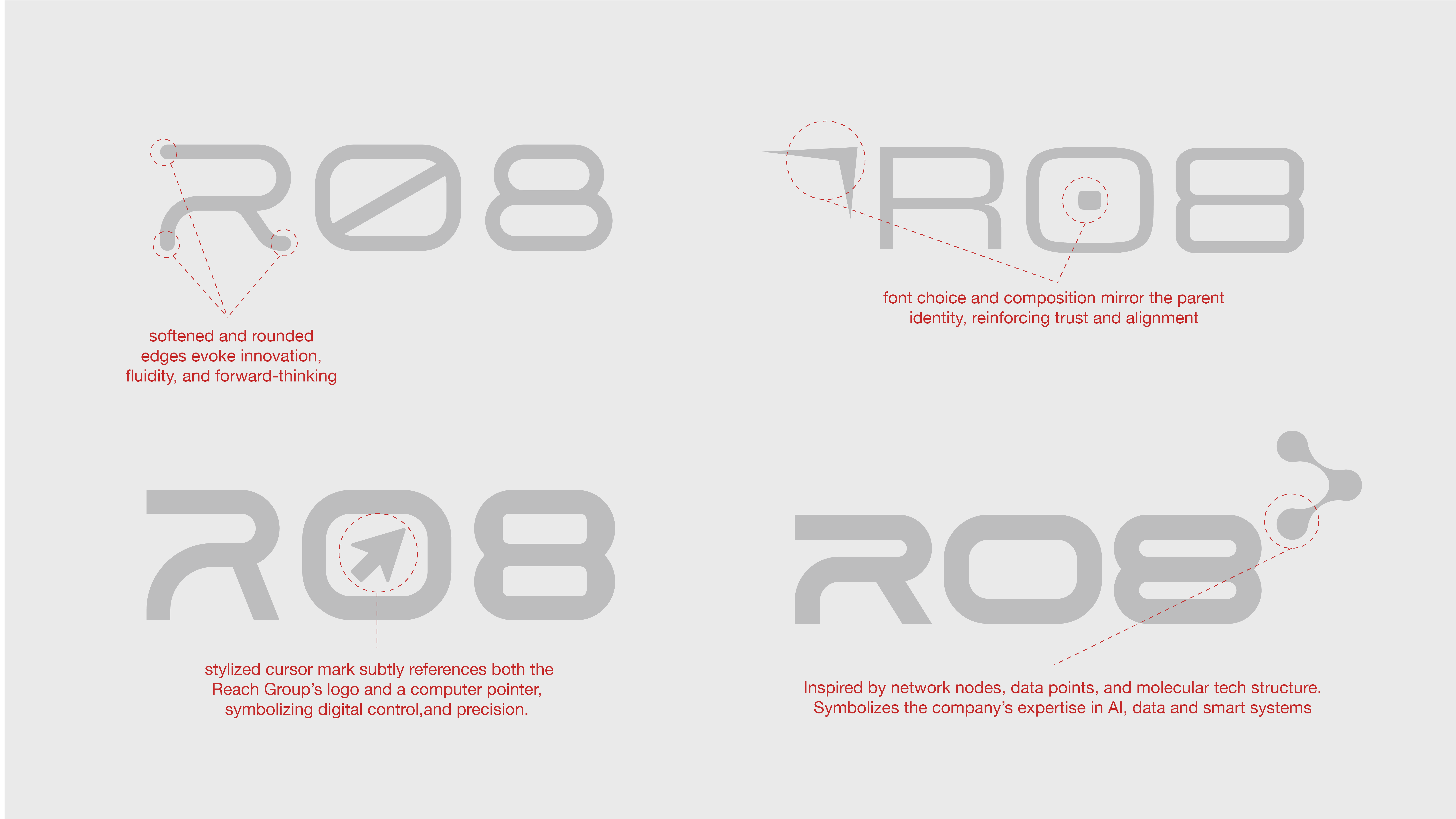
Its aim is to help clients across sectors through smart, secure, and scalable innovation. Every element of the name carries meaning: R for Reach, 0 for a fresh start, and 8 as a symbol of infinity and limitless growth.
The brand was originally developed for a high-stakes debut at a tech conference, making it a time-sensitive brief with executive visibility from the start.
Outcome
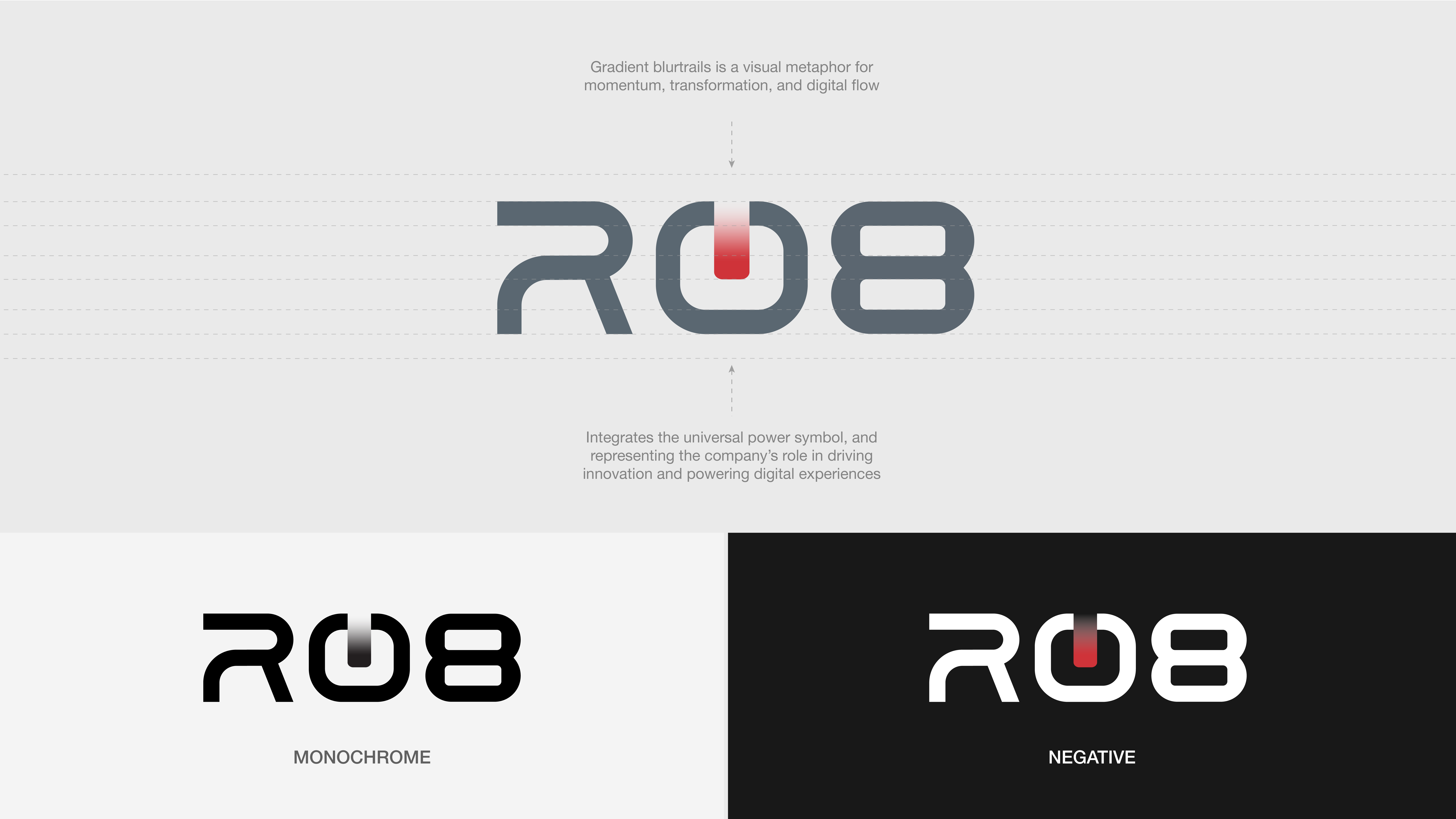
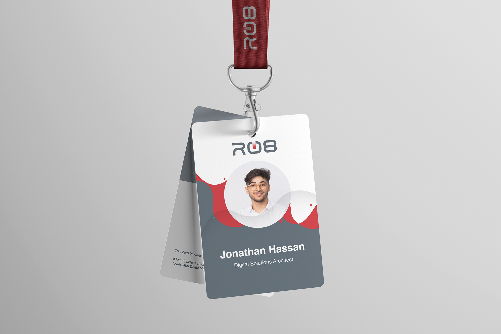
As the in-house designer, I developed R08's brand identity from the ground up, translating the company's name, values, and positioning into a cohesive visual language. The result is a modern, minimalist identity system that is grounded in Reach Group's color palette while carving out a distinct presence for R08.
Key Stages
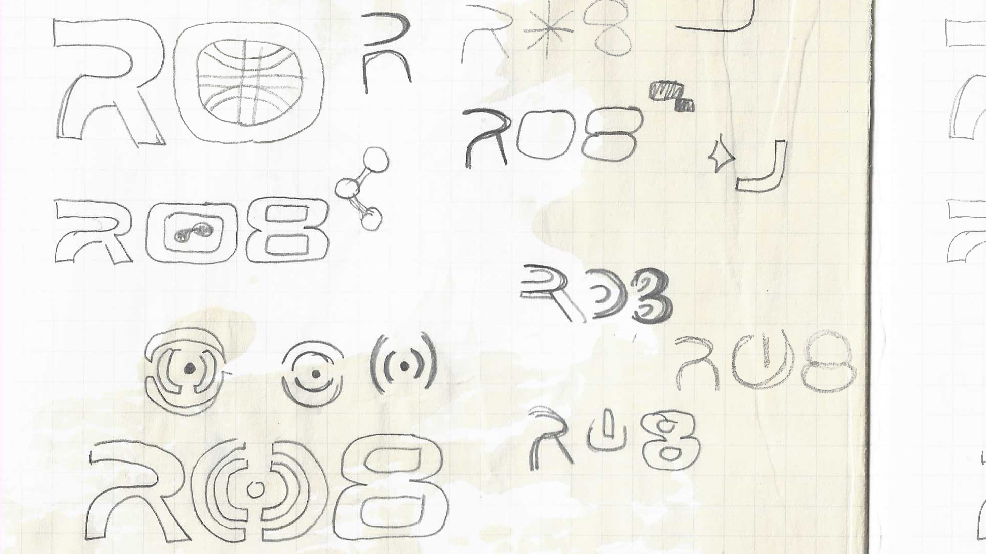
With the name's symbolism as a starting point, I explored how R, 0, and 8 could inform the visual direction, whether through typography, form, or subtle graphic elements. Early concepts were developed around the brand requirements: clean, tech-forward, and typographically strong.
Final Design
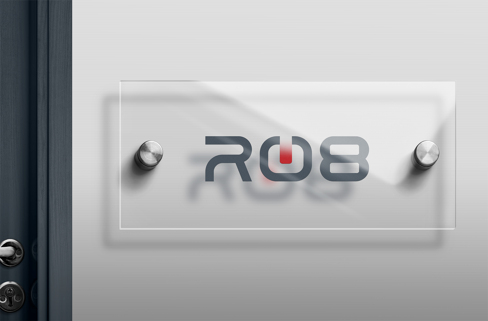
The final approved identity delivers a modern, minimal brand system with strong typographic presence and purposeful symbolism.
Impact
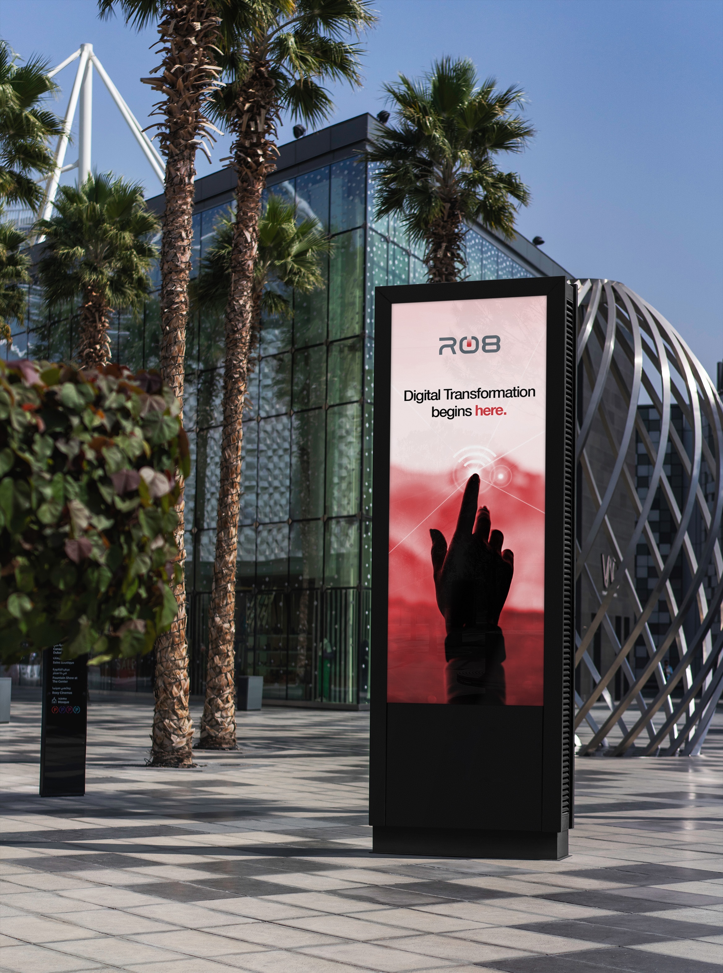
R08's brand identity was delivered complete and conference-ready, a full visual system that clearly communicates the company's positioning as innovative, trustworthy, and built for scale.
Learnings
As I built a brand with just a name and a set of constraints, it made me realize some things:
There’s a fine-line between meaningful and forced
Designing around R08's name meant every visual decision had to earn its place. The challenge was keeping the symbolism intentional without letting it tip into something that felt forced.
Shipped or not, the work counts
Not every deliverable makes it to launch, and in-house work taught me that early. The brand system was complete and ready, but work sometimes becomes unshipped, and that's okay.
Sell the thinking, not just the design
After multiple revisions with feedback from executive stakeholders, a strong concept still needs to be communicated clearly. Knowing how to walk a room through your design thinking is as important as the design itself.
Next Work